As the name suggests, cart abandonment is when users place items in their cart on your ecommerce website but do not complete the checkout process.
If you can imagine a trolley of goods being left in the aisle of a supermarket, that’s essentially what’s happening but on your website. Nobody is coming back for those goods, as something along the chain has caused doubt in their mind about purchasing the items.
Any website content management system worth its salt will give you in-depth reports relating to your cart abandonment rate. With that information, the aim is to reduce the level your ecommerce store receives as much as possible. After all, every time a user abandons their cart, this means fewer sales for your business.
But could streamlining the checkout process hold the answer? As a leading ecommerce agency offering website design and marketing to our clients, here is our take.
Top Reasons For Cart Abandonment
- High additional costs (shipping, taxes etc)
- Forced account creation
- Complicated checkout process
- Security concerns
- Inability to calculate costs upfront
- No coupon code
There are many reasons for cart abandonment, though you’ll notice there’s a clear split between pricing elements and also website issues.
While adapting pricing structure and policies comes down to being a business decision, website issues require the expertise of an ecommerce website specialist to fix for you. That’s because the customer journey and overall user experience need to be taken into consideration.
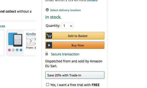
Add A ‘Buy Now’ Button On Product Page

Sometimes, there are simply too many screens and ultimately hoops to jump through between your store and the actual checkout, which can be highly off-putting for visitors. Similar to in a real store when at the checkout, you’re asked if you want to buy a dozen unrelated items, the experience can end up feeling more frustrating rather than helpful. In the end, people will simply exit the page and head elsewhere. With the likes of Amazon offering quick buy options, a clunky checkout experience isn’t something your brand can afford to ignore.
Instead, humans like simple, clear actionable steps, which is why a ‘buy now’ button offers a quick escape for them and a quick win for you in the process. It also subconsciously gives the user an instruction to follow, because it’s quite literally telling them to buy the item.
From a web design perspective, buttons can be added seamlessly to any page and look great on mobile just as they do on desktop. So they will not reduce the browsing experience of your page, instead, they will enhance it, especially when used appropriately.
Remove Navigation Bars In Favour Of Progress Bars
If you’ve ever completed a survey online, you’ll notice they often place a progress bar on there, just to will you through to the end. Otherwise, you’d likely click off thinking it will take all day. Ecommerce checkouts work in a similar way, in that people like to know where they are in the process. One such method of informing people and ultimately keeping them on the page is to rely on progress bars rather than navigation bars.
Make no mistake about it, navigation bars certainly have their place. But when you’re dealing with time-conscious customers who can head elsewhere in a couple of clicks, you want to make sure the process is as smooth and efficient as possible. Therefore, switching to a progress bar specifically for checkout pages will keep them on task, rather than tempting them back to the homepage or worse still, to that little ‘X’ in the corner.
Gamification
Nothing keeps people engaged quite like firing up their reward cortexes within the brain. We are of course talking about when you throw people a free coupon on your site or offer them a spinner board in which they can win prizes, even if it’s as simple as getting free delivery. This is known as gamification, which essentially means gameplay elements have been incorporated into the website.
While such incentives may be a business decision, they require technical precision to execute properly, not least to keep them on brand. The aim is to incentivise customers to purchase and reward them for their loyalty, which may just get them over the line versus a competitor website that offers no such rewards for its customers.
Heat Mapping

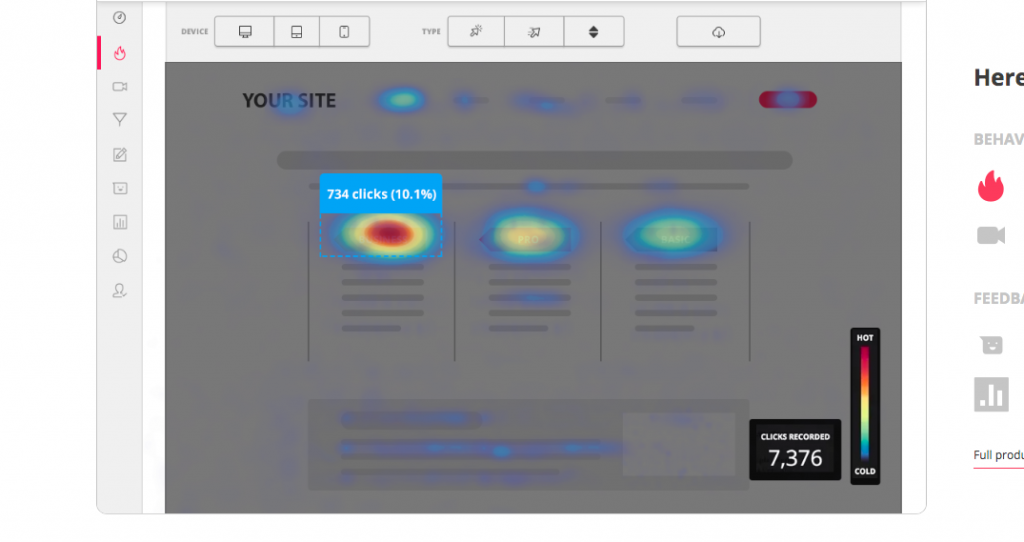
We’ve discussed heat mapping in a previous post. But for the uninitiated, it involves taking a look at where the activity is taking place on your website in terms of scrolls and clicks. In the case of your ecommerce website, it can help identify where people are ending their journey on your site.
For example, perhaps they get to the last page but this is when they are confronted with high shipping costs. Or, there could even be a technical glitch preventing people from continuing. You won’t know unless you get under the bonnet of your website to analyse its heat mapping. From there, you can make any necessary business decisions or technical changes to keep the flow of traffic moving from your product page to your completed sales page.
Ecommerce Website Design & Marketing UK
View our ecommerce website design services
If your ecommerce website isn’t bagging those all-important sales, we’re here to help. The above is just a snapshot of some of the tricks up our sleeves when it comes to reducing cart abandonment.
We craft a unique approach to each of our client’s websites, depending on the issues we find and of course, what will suit their brand. So in order for us to help you reduce your cart abandonment rate, we first need to know a little about you!
Imaginaire Digital is a web design agency based in Dubai. We also cover Mansfield, Derby and Leicester. Some of the services we provide include website design, SEO, PPC, Google Ads management, social media marketing, lead generation, and more.
Ready to get started? Simply book your free consultation and we’ll get to work on devising a strategy tailored to your business. Or, drop us an email or call us on 0115 971 8908 to find out more.
You can even get a free website review from our specialists. Just head over to our free website review page and we’ll take a look!


