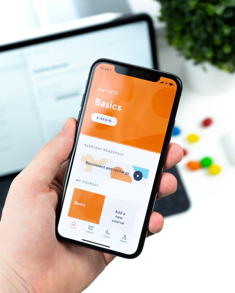
As of 2023, mobile use stands at 53.59% compared with just 44.59% for desktop (with tablet use picking up the remaining usage). That’s according to Statcounter.
Why does this information matter if you own a website? Well, if your website isn’t responsive then it won’t automatically adapt depending on what device or browser your website is being viewed on.
In short, a non-responsive website isn’t user-friendly, and will ultimately cost you conversions. That’s because just like you, your users won’t hang around if your website doesn’t load properly, or if the functionality is poor.
It’s for that reason that many web developers and designers take a ‘mobile first’ approach when building websites these days.
If your website isn’t mobile-friendly, then the team at Imaginaire are best placed to help you. These are just some of the steps we’ll cover as team to ensure an excellent experience for mobile visitors when you work with us.

Responsive Website Design
While the nitty-gritty of responsive web design can get quite technical, the basics are quite simple. That is unless your website has been built with responsiveness in mind (i.e. a version for mobiles and tablets) – it’s probably not responsive.
For example, maybe you built the website yourself on Wix or a similar website builder. Or maybe, your website was made many moons ago, back before mobile use was even a thing. In either case, if your website doesn’t look or function as intended on mobile, then your website needs to be rebuilt so that it’s responsive.
Sure, that’s going to come at a cost. Ultimately, having a non-responsive website in the age of mobile-first will cost far more, especially if you rely on your website to pull in sales for your business.
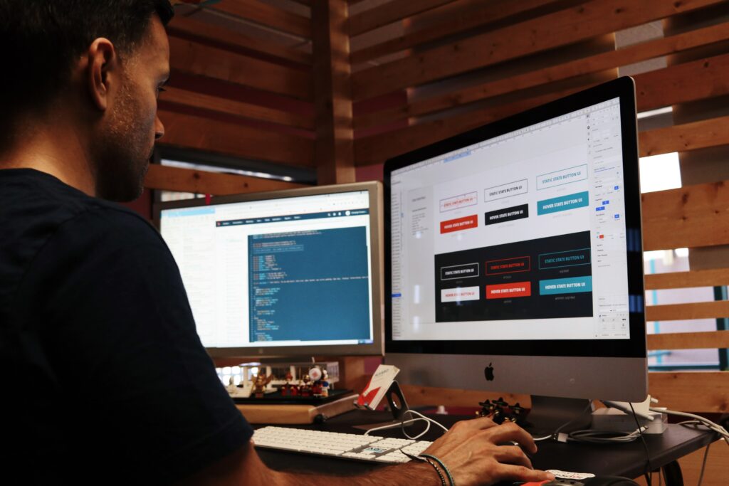
Building a responsive website means building versions for desktop, mobile and tablet simultaneously. Each format will be tested throughout to ensure the content automatically adapts to different devices, screen sizes and browsers.
Mobile Friendly Navigation
It’s a simple fact that the way we browse websites on our phones is very different to when we’re using a laptop. For one, we don’t have separate mouse buttons and even the keyboard functionality is very different.
The two main methods used for website navigation on mobile devices include hamburger menus or accordion-style menus.
Hamburger menus are the most recognisable and typically consist of three horizontal lines stacked on top of each other. When tapped, additional pages or content appear for the user to view. Otherwise, these pages are neatly hidden away.
The reason why navigation needs to be different on a mobile isn’t just because we scroll and tap with our hands (as opposed to clicking and typing on a computer keyboard). It’s also due to mobile screen sizes being much smaller, meaning navigational traditional menus just don’t work when screen size is at a premium.

Optimise Your Content
On mobile devices, scroll fatigue is a thing. Using portrait, rather than landscape images can often mean the whole image isn’t in view without a lot of scrolling. Instead, images should automatically fit the screen width and be in full view.
Any text should also automatically fit the width of the screen. There’s nothing worse than having to scroll left and right to read a line of text, and as you probably expect your users will give up rather than give themselves a headache trying.
In short, text, images and other media should be fully viewable and adaptive to small mobile screens. This also means using the correct font sizes which may differ from the desktop version of the site.
Also, some plugins, buttons or even media might not be viewable outside of a desktop format. This is also why thorough testing is needed for each page when building a responsive website.
Avoid Pop-Ups On Mobile
Pop-ups can be used to advertise promotions or even gather subscribers for your newsletter. However, pop-ups can come at a cost to your website. Not only do pop-ups slow down how long it takes for your pages to load, but on mobile, they may not be functional and could prevent the user from being able to access the page at all.
The solution is to use elements designed for desktop only on desktop, rather than trying to make a one-size-fits-all website, which simply isn’t possible. Any elements that need to be added to the mobile version of your website should be specifically geared for mobile functionality.

Imaginaire – Get A Responsive Website Built By Our Experts
Does your website do your business justice when it’s viewed on a mobile or tablet?
If not, then it’s time to get our web designers and developers on board to fix that for you!
Based in Dubai, Imaginaire is a digital marketing agency specialising in responsive and highly converting web design.
To get a free website review, or find out more about our services drop us a message or give us a call on 0115 697 1541.


