Every business in the world wants to improve its conversion rate. So it’s hardly surprising the search term “conversion rate optimisation” has seen a big spike in interest in recent years.

If you’re not converting website visitors into leads or customers at a decent rate, you’ll struggle to make money online. Conversely, get your conversion rate optimization (CRO) right and the benefits are huge – save money on your ad spend by reducing wastage; drive more results from your organic traffic; delight your sales team by giving them a constant stream of qualified leads; the list goes on.
However, there’s a big difference between wanting to improve your conversion rate and actually doing it. Just 22% of businesses say they’re satisfied with their CRO strategies, while only 32% strongly agree they’re being strategic and proactive – as opposed to tactical and reactive – in their approach to conversion rate optimization.
With that in mind, here are nine best practices to help you do more effective, impactful CRO in 2021.
Best Practice #1: Test With a Clear Hypothesis & Goals
Conversion rate optimization should never be based on guesswork. If you’re rewriting your page copy or adding new calls to action (CTAs) based on nothing more than gut feeling, you’re not doing CRO – you’re just making a few tweaks and seeing what happens.
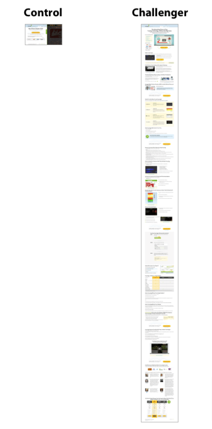
Instead, it should be based on data. Every time you make a change to your website or PPC campaigns or social ads (or anything else) with the aim of improving conversion rates, you should test your new “challenger” approach alongside a “control” subject – typically whatever you’ve got in place at the moment. For instance, Crazy Egg ran an A/B test that pitted its existing homepage against a new, much longer variant:
To run effective conversion rate optimization tests, you need to get two things in place upfront:
- A hypothesis: What’s the problem you’re facing – in other words, the reason you’re running this test in the first place? What’s your proposed solution? And what metric will you use to determine whether or not it’s worked?
- Goals: What are you hoping to get from the test? For instance, if you’re optimizing a lead generation form, your goal will likely be to drive form submissions. At times, you might have multiple goals, but you should always pick one primary goal.
Best Practice #2: Build Your CRO Tech Stack
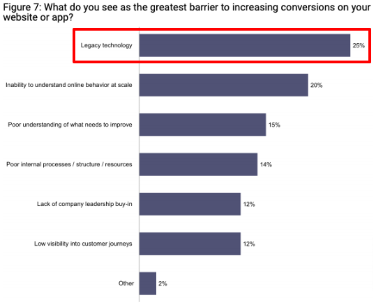
If you don’t have the right tools in place, you’ll struggle to do effective conversion rate optimization. In fact, legacy technology is cited as the number one barrier to increasing conversions.
I’m not saying you need to invest thousands of dollars to do CRO well. It’s just a case of picking the right tools – some of which are completely free – across the following key areas:
- Web analytics: You need an analytics tool to identify and monitor your conversion rates, and to measure performance toward achieving your goals. These tools can also help you pick out pages with poor conversion rates, thereby helping you find areas for improvement. Google Analytics is free and is used by more than half of the world’s top 10,000 websites.
- A/B testing: To identify what works and what doesn’t, you need a tool that lets you test different variants alongside one another. You can do this through Google Optimize – and again, it won’t cost you a cent.
- User feedback: One of the best ways to generate new ideas for improving conversion rates is to see how visitors currently interact with your website. To do this, you’ll need a heat-mapping tool like Hotjar, plus a user testing tool such as Userfeel.
Best Practice #3: Understand the Most Effective Lead Gen Forms
There’s a good chance lead capture forms will be a big focus of your conversion rate optimization tests, especially if you’re a B2B brand.
Why? Because these are the tools you use to capture leads. A high-performing form makes a huge difference to the volume of leads you generate, so forms are an obvious starting point for your CRO strategy. Those forms come in lots of different flavours, such as:
- Popups: As the name suggests, these forms pop up when you first hit a landing page, or scroll a certain way down the page.
- Signup boxes: Look the same as popups, but only appear when the user clicks them.
- Landing pages: A page that’s purpose-built for capturing leads through an embedded form.
- Wheel of Fortune: An interactive element that invites visitors to spin the wheel and collect a discount or some other offer.
- Registration forms: Just as it sounds, this type of lead generation form encourages users to create an account or sign up for a free trial.
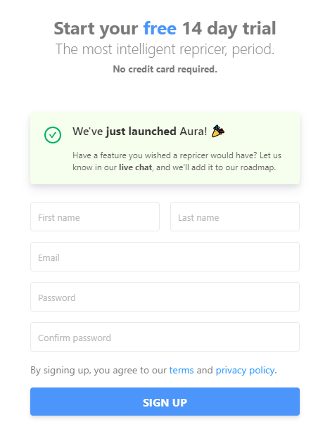
A prime example is the registration form Aura uses to let users sign up for a free 14-day trial. It uses clear and concise language and only asks for three details: first name, last name, and email address.
Some of those form variants are more effective than others. According to Omnisend, landing pages are by far the best performing of all signup forms – yet they’re also the least used.
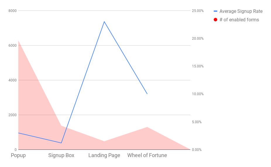
On the flipside, popups are overwhelmingly the most popular type of signup form, yet they achieve the second-lowest signup rate.
The lesson here? Popups and Wheel of Fortune spinners might look flashy, but a high-quality landing page is hard to beat.
Best Practice #4: Keep Lead Gen Forms Concise
So we’re agreed – choosing the right type of lead generation form is a crucial piece in the conversion rate optimization puzzle.
But there’s a lot more to it than that. Once you’ve identified the right type of form to use, you need to make it work for you. That means being strict with yourself about the information you truly need to capture from your leads (vs. the information you’d simply like to have).
Why is this so important?
Because completion rates drop off significantly when more than three fields are included on a form.
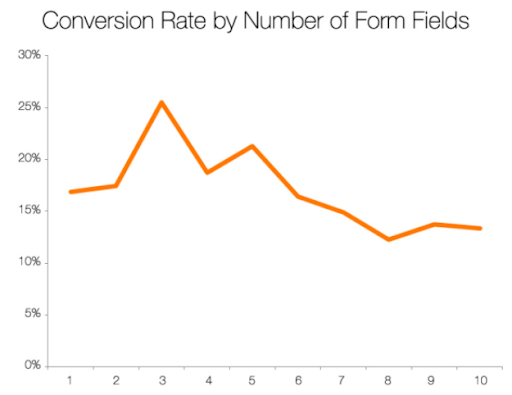
Sure, in an ideal world you might want to capture your lead’s:
- First name
- Last name
- Job title
- Company
- Phone number
- Email address
And lots more. But how much of that information do you need upfront? And how much can your sales team find by doing a couple of minutes of basic research?
Keep your forms as concise as possible.
First name and email address are possibly the two most vital pieces of information you need from a lead, and it’s even more beneficial if email marketing is part of your strategy.
When it comes to lead gen forms, the saying “less is more” certainly rings true.
Best Practice #5: Drive Users to Take Action
If you want to improve your conversion rates, you can’t afford to be passive. Don’t just hope customers will come running to your site and convert on their own – you need to gently nudge them in the right direction!
To understand how this works in practice, look no further than Booking.com. Just look at all the tactics it uses within a single hotel listing to convince potential customers to book right now:

Within that one listing, Booking.com tells us:
- The hotel is offering a massive reduction in price on this type of room
- But this offer is only available for a limited period
- Not only that, but there’s only a limited number of rooms available at this price
- If you book now, you can cancel later for free anyway – so there’s no risk attached
Once you’ve read all those things, there’s really nothing stopping you from hitting “See availability”.
An example in the B2B world would be Nectar, an employee recognition software company.
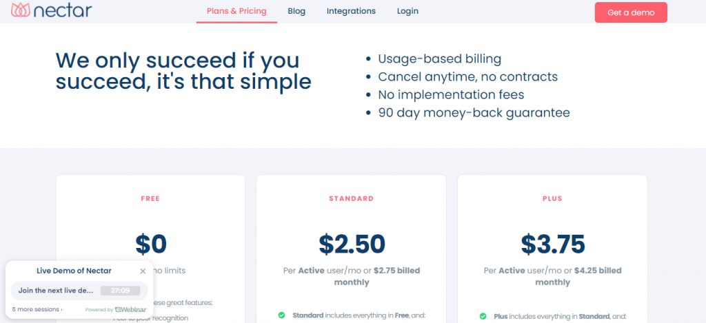
Like Booking.com, Nectar uses a number of tactics to prompt users into taking action:
- They can cancel anytime and won’t have to sign a contract, making it easy to stop using if the software isn’t a good fit
- No implementation fees will need to be paid
- A 90-day money-back guarantee means it’s risk-free to try
- There’s a free option that comes with an impressive amount of features
- Live demos of the software are available to see it in action before becoming committed
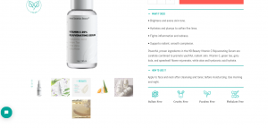
Lastly, let us look at Herbal Dynamics Beauty as an example of how a company can drive users to take action. If you visit some of their product pages, you will be greeted with a couple of things:
- Their main features are highlighted as graphics such as being ‘fragrance-free’ and part of the ‘clean beauty’ trend.
- They have a bulleted list of ‘how to use the product’ and ‘what it does’ which helps customers understand whether the product is right for them:
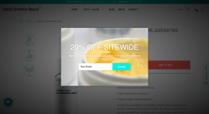
- Lastly, but probably the most important- they reel a customer back in with an exit-intent pop-up. These pop-ups come up when a user hovers up to the tab to cross out. The pop-up will offer a great deal like 20% off in exchange for something as simple as your email. Herbal Dynamics Beauty does this on a couple of their pages such as their Vitamin C Serum product page below:
Best Practice #6: Use Social Proof to Push Conversions
Trust is key for driving leads and sales, which in turn makes it an important element in conversion rate optimization.
One of the ways you can build trust is through social proof. Simply incorporating testimonials on a sales page has been shown to drive conversions by as much as 34%. But testimonials aren’t the only form of social proof you should be using – other examples include:
- Social media shares
- Review scores from platforms like Trustpilot and Feefo
- Social media reviews
- Certifications and accreditations
- Mentions from high-profile brands and publications
- Industry awards
Look how Houston personal injury lawyer Attorney Brian White & Associates also display social proof on his site in the form of testimonials and below them, logos of the organizations he’s been featured in:

The best thing about this? If you’re good at what you do, demonstrating social proof is easy. Your customers will be happy to review you, say nice things about you, and share your content – you just need to ask them!
Best Practice #7: Treat Conversion Rate Optimization as a Continuous Process
You’ve got your tech stack in place, you’ve set goals and hypotheses, and tweaked your lead gen forms. But your conversion rate still isn’t improving. What’s going on?
There’s a good chance the issues you’re seeing are down to your mindset.
Simply put, conversion rate optimization isn’t something to dip into every now and again. To yield the best results, you need to be doing it continuously, following each of these five steps before looping back to the start:
- Research: Dig into your analytics data, heat maps, user feedback, and more to identify areas for conversion rate improvements.
- Ideate: Come up with ways to increase your conversion rate based on the data available to you.
- Prioritize: Identify the actions you expect to have the biggest impact and implement them first.
- Launch: Roll out your top-priority action or start your A/B test.
- Review: Look at the results to understand what worked (and why). This step naturally feeds back into the research stage, and the whole cycle begins again.
Best Practice #8: Create Strong CTA Buttons
There’s plenty of room for creativity in the world of web design and user experience. Generally, the more creative you get, and the more you experiment, the more you’ll discover unexpected tactics that drive results.
However, you shouldn’t experiment with everything.
One of the elements of your site that you probably shouldn’t be playing around with too much is your CTA buttons. The fact is, your visitors are used to CTA buttons. They look out for them and instinctively understand that when they see one, it’s a trigger to drive the desired action. In other words, it clearly roadmaps where they should go next.
When every other website is using CTA buttons, it’s not a great idea for you to rip up the rulebook and go in a completely different direction.
Your CTA buttons should incorporate a few key characteristics:
- A different colour from the page’s background, so they stand out
- A few words of copy that compel the user to click
- A defined border or shape that clearly identifies them as a button to be clicked
Here’s a pretty classic example of how this should look, from personal injury lawyers Rosenbaum & Rosenbaum:

However, that’s not to say there’s no room for experimentation here. Stick with the basic design, but feel free to play around with the colour, copy, size, font, and location of your CTA buttons.
Another example comes from the Law Offices of Jay Knispel, a personal injury firm in New York.

Knispel uses a bright blue CTA button that tells readers to book a free consultation and puts it close to a client testimonial, which is pretty clever.
Best Practice #9: Take Learnings From CRO Tests
I’ve already briefly referenced this, but it’s such an important conversion rate optimization best practice that it deserves its own separate point.
After every round of testing you perform, take the time to deep-dive into the results so you’re completely clear on what happened and why. As a minimum, strive to answer the following questions:
- Why did the “winning” approach increase conversion rates?
- Conversely, why did the loser fail to do so?
- Did the experiment turn out as expected?
- If not, why?
- What does this tell you about how customers interact with your key pages?
- How can you utilize the same hypothesis across other pages?
Once you’ve done that, you’ll be much better prepared to plan and launch your next test, which in turn increases your chances of making further conversion rate improvements.
Wrapping It All Up
Sure, there’s a lot of elements to this. If you’re new to conversion rate optimization, I’m not expecting you to put all this stuff in place immediately.
But if there’s one key thing I urge you to take away from reading this article, it’s this: always view CRO as a long-term project.
You wouldn’t “try SEO” by targeting one keyword for a month, then giving up if you don’t immediately hit the top of Google. In the same way, don’t expect to dip your toe into CRO for a short period and expect to find all the answers to your conversion rate problems.
Before you get started, plan multiple tests upfront, and commit to running each for however long it takes to generate the necessary data – whether that’s a week, a month, a whole quarter, or even longer.
Eventually, the incremental improvements you’re making will add up to a significant increase in your overall conversion rate.
About the author: Freya is the founder of the personal finance blog CollectingCents that teaches readers how to grow their passive income, save money, improve their credit score, and manage debt. She has been featured in publications like Business Insider, Fox Business, the Huffington Post, and GoBankingRates.


