One of the things we talk about a lot is the effect of big brands on the typical search results pages and that’s most obvious in the e-commerce space. For a lot of newer/smaller stores, that creates a David vs Goliath effect which can be offputting.
Luckily, Google loves relevance and having a store that is super focused on one thing, rather than the likes of Amazon that sell everything and anything, can lead to outranking the tech behemoths of the world when it comes to Ecommerce SEO.
Unfortunately, with SEO, it’s not just a case of building it and they will come, however. One thing that nearly always gets overlooked and is one of our first recommendations in our e-commerce SEO service is site structure and creating the kind of structure that’s helpful to customers and that’s easy for Google to understand and attach relevance to.
The normal e-commerce site structure
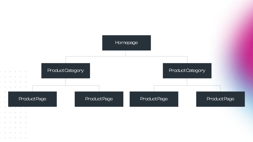
The typical site structure that an ecommerce website designer will use for an online store is the one that comes ‘out of the box’ with whatever platform has been used to build it. For the menu and site structure, you’ll usually have a homepage and a top level of other pages about the company and, underneath that layer, some product categories and under the product categories you’ll have your products.
That’s actually not a bad structure, you have everything separated and it’s definitely better than some stores that we see where the structure is completely flat and product categories are barely used.
Some stores will even take this a step further and implement product tags to allow them to create unique landing pages for types of products (i.e. Grey Sofas).
This is how the typical structure will look from a crawler’s perspective:

Introducing content silos and supporting content
Taking SEO out of the equation just for a second, what should your e-commerce store be doing to enable high conversion rates and, ultimately, more revenue?
Well, if we take it back to when stores were bricks and mortar, do you remember walking into a clothes shop to be confronted by a salesperson that would ask if you need any help? Most of the time you’d say no and continue to browse, but sometimes you’d have a question about something that wasn’t so obvious.
Going back to our sofas example, you might have been interested to know which sofas would be best for a household with young children or pets and so you’d ask the salesperson and they’d then show you the best options for your needs. That’s precisely what your online store should be doing.
We do this as a mixture of subcategories and product tags — i.e. we might tag all of our hardwearing sofas as pet-safe and family-friendly. This would create two landing pages that we could optimise for search (“pet-friendly sofas” which gets 350 searches per month and “family sofas” (300 searches per month)). We can also build out the content in a way that clearly advertises why these sofas are great for those circumstances.
As well as having the landing pages from above, you might also plan some supporting content that isn’t particularly trying to sell anything but just helps the user when it comes to making their decision. An example would be an article about the best fabric choices for homes with pets.
Find out more from our blog on creating a successful landing page.
URL structure
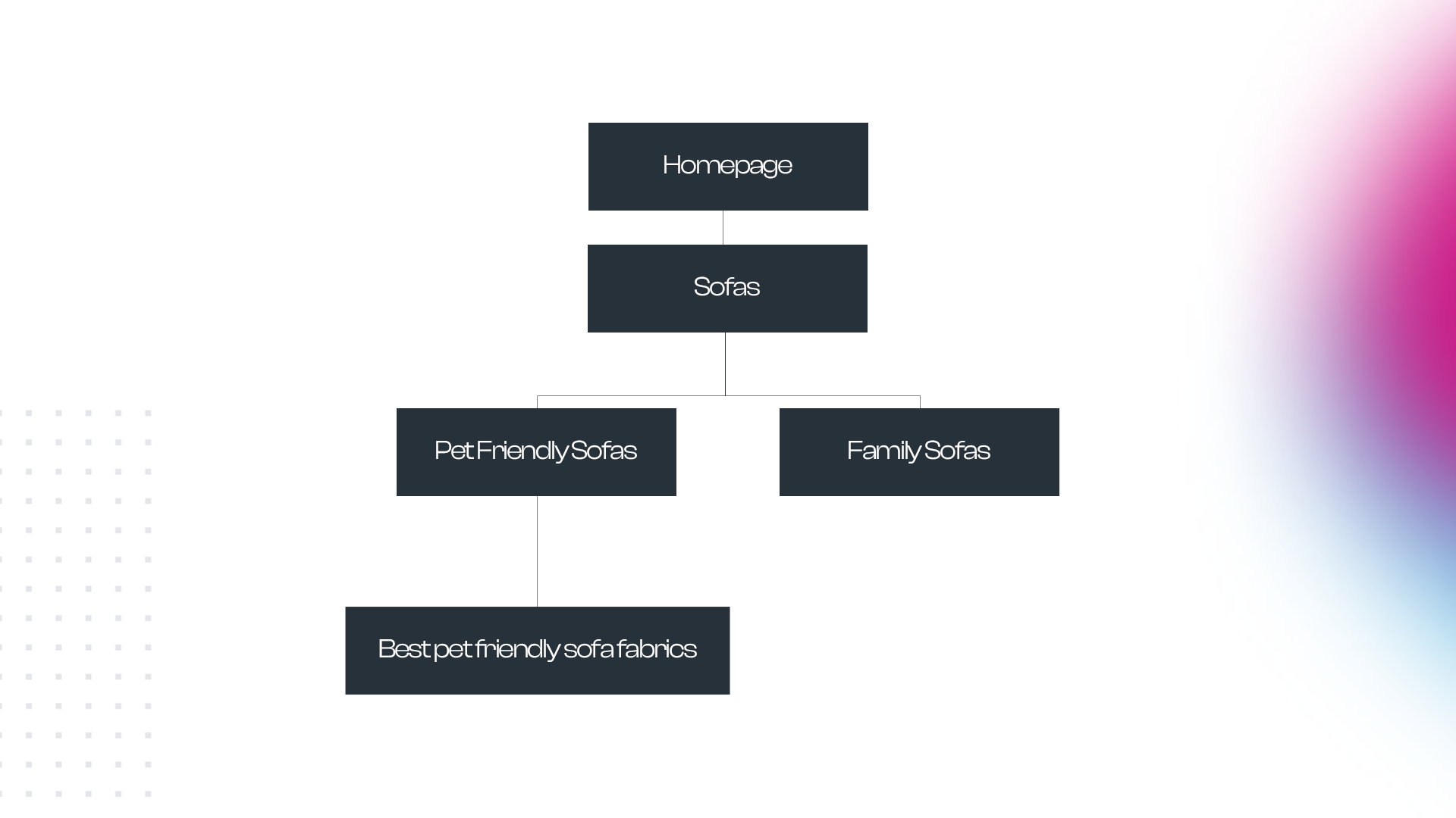
With a bit of tech know-how, we can place these sub-topics under the main category page URL. This creates a structure that search engines can follow which creates a lot of relevance for the main search term (i.e. sofas).
In terms of the URLs for the new pages, they would look like this:
furnituresite.co.uk/sofas/pet-friendly-sofas/
furnituresite.co.uk/sofas/family-sofas
furnituresite.co.uk/sofas/pet-friendly-sofas/best-fabrics-for-pets/
A diagram of this would look like this:

Internal linking
Now, to really maximise the effect of our new, improved e-commerce site structure, we need to make sure that the pages in the content silo link with each other effectively.
In our example above, we would make sure that the sofas page contains links to all of the sub-categories within it. Then, for the pet-friendly sofas subcategory, we would make sure we link to any supporting content that would be created (i.e. our best pet-friendly sofa fabrics article) and that the supporting content equally linked back up the chain to the pet-friendly sofas page.
Doing this is helpful for users as it gives them an easy way to navigate through the site structure.
You can also implement breadcrumbs on your website which can give users an easy way to retrace their steps, i.e.:
Home > Sofas > Pet-Friendly Sofas > Best Pet-Friendly Sofa Fabrics
Rounding up
So, in conclusion, one of the main things that we want to avoid when optimising an e-commerce site is a flat site structure. We want to create a structure that helps users and creates a lot of relevance in the eyes of search engines.


