Anybody can build a website, but that doesn’t automatically mean that the website will generate a high number of visitors, leads and ultimately conversions as a result.
The average landing page has a conversion rate of 2.5%, with anything above 11.45% considered an extremely high conversion rate percentage. If we were to put that into numbers, that would mean the average website earns between 2.5 and 11.45 sales for every 100 customers who visit the website.
With conversions being extremely precious even for the most successful of websites, the question is are you doing everything you can to improve your conversions? This includes looking at possible technical errors, which could be majorly holding your website back without you even realising.
Conversion rate optimisation (CRO) is the name of the game here, and it’s all about removing any obstacles between users and your products or services. Here is an overview of some of the most overlooked conversion rate optimization techniques to explain further.
Speed Up Your Website

Load speed can make or break a website, with 25% of visitors abandoning a website altogether if it takes more than 4 seconds to load.
It’s fair to say that users hold as much disdain for a slow loading website as they do a long queue at the supermarket checkout. Only, they aren’t just abandoning their trolleys, they aren’t even getting through the door in the first place because your content is taking too long to load.
Hasty exits also push up your website’s bounce rates which is bad for SEO. If the slow pace continues while users are on your site, it could also lead to high cart abandonment and a general dissatisfaction with your site.
There are many factors that can contribute to a website having a slow load time. If the hosting platform isn’t located in the UK, then a CDN (content delivery network) may be needed to distribute your website to servers located a little closer than the USA, Australia or wherever else your site is being held, so that the load time is much quicker. This is not as complicated as it sounds to arrange, though isn’t something most website owners are aware of when signing up for hosting, especially if it’s not a UK based platform.
Most of the time though, a website is slow to load due to an overuse of graphics, autoplaying videos, pop-ups and general glitches within your website’s code. So, it will need optimising to ensure faster speed times can be reached.
Have A Clear Purpose For Each Page

If we head back to our supermarket analogy for a second, have you ever been down an aisle of a supermarket and found the layout to be really confusing? It can be a frustrating experience when the purpose of something that’s been presented to you isn’t clear. The same experience is also being had by your visitors, if your web pages don’t have a clear purpose, i.e. the content differs vastly from the header description.
When designing a website here at Imaginaire, we create a wireframe that’s essentially a giant map of your website, telling us not only what each page will be for, but how it will link to the next. We and other website designers do this because we need to be sure that there’s a clear plan for your site, and that the objectives of each page can be met including within the copy and overall features of the page.
Bringing this back to the idea of conversions, it’s important to think about how a particular page plays its part. As well as having features such as contact information, social media icons etc – what is that page actually doing to sell your products or services? That’s the tough question we ask of a webpage, and any website owner needs to be doing exactly the same for every page of their website too.
Work Above The Fold

UX designers consider every pixel of a webpage, though the top ⅓ of a page known as ‘above the fold’ is where it counts the most.
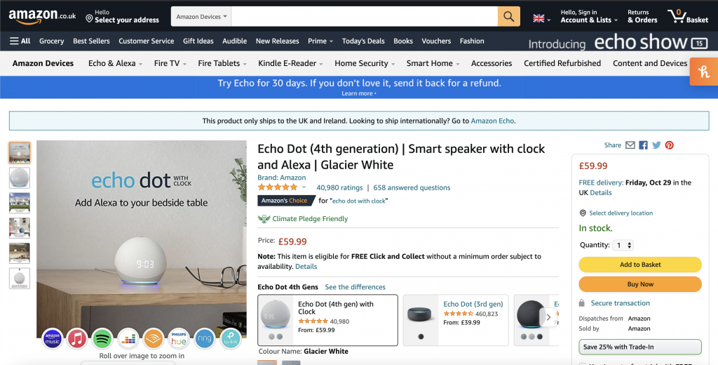
Similar to how on an Amazon listing, all of the key information and purchase features are within the top section of the screen, the same approach also needs to be adopted for your content too.
The simple fact is that users don’t want to go on a wild goose chase to find what they are looking for. So while that hero image that stretches the full length of the screen might look nice, it’s hogging the central focus of the page, rather than the part where people can actually contact you or purchase on the page directly.
If your key bits of information such as ‘click here to purchase’ requires endless scrolling, it’s just not going to cut it where boosting your conversions is concerned.
Reduce The Number Of Fields In Forms

You want to leave your name and number for a company to give you a quick call back, and it goes a little like this…
Name:_____
Address:_____
Email:_____
Phone:_____
Job title:_____
Blood type:_____
Star sign:_____
Eye colour: _____
We jest in part, but the reality is nobody likes excessively lengthy forms. Also, in the age of data protection, users may be put off by sharing too much personal information. So while you may require some additional details to give a tailored service or quote, keep each field relevant to your customer without seeming intrusive.
Otherwise, users will head to a competitor’s website who will allow them to get straight to the point.
Give Your CTAs More Thought

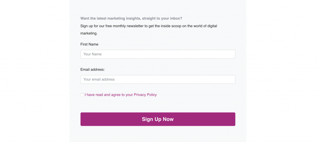
CTAs (call to actions) need to be visually prominent on your website, along with enticing in nature. Whether you’re offering an unmissable coupon code or want people to sign up for your newsletter, it needs to feel enthusiastic from your side, otherwise, why will people bother?
Typically, CTAs and conversions are normally closely related, such as ‘buy now to get 10% off’, or ‘our sale ends in *insert countdown timer here*, or even ‘3 people bought this item today!’. Whatever it is, make it count. If your conversions are lower than is ideal, it’s highly liking your CTAs are the broken link in the chain, especially if everything else above has been taken care of.
Conversion Rate FAQ
Still in the dark about conversion rates? We’ve answered some of the most common questions about conversion rates below, but if you have any further questions, be sure to contact us!
What Does Conversion Mean?
In essence, a conversion is another term for a sale. It means a website visitor has converted into a paying customer. So, the conversion rate looks at how many users visited your website, and how many went on to purchase as a result.
Tracking software also exists which can help keep tabs on conversions, since a user may not purchase immediately. As an example within affiliate marketing, if a purchase is made on a product that a user clicked on within 30 days, it still counts as a sale.
How To Find My Conversion Rate?
Conversions can be subjective since they can originate from a number of sources, and may not happen straight away. However, an easy tip is to take the number of conversions you have and divide this by the number of interactions the content received.
For example, if a social media post of a product received 1000 likes and it sold 50 items, then the conversion rate would be 5%. As a digital marketing agency, we have a number of techniques specific to the format (i.e website, social media, cold calling etc) to calculate a conversion rate which we’d be happy to advise you on.
How To Increase My Conversion Rate Ecommerce?
As well as factoring in the above techniques, it’s essential to remember that a mobile-first approach to web design will cater for the increasing number of mobile versus desktop users your website likely receives. If your website isn’t responsive, then it’s not going to display properly for mobile or tablet users, and the functionality will be poor. Therefore, aligning your website’s content with not only your intended purpose but how people access your website is key.
Conversion Rate Optimisation – Consultant CRO Services
For any business owner wanting to maximise their conversion rate, it pays to get the experts on your side.
Here at Imaginaire, we help our clients with all aspects of their digital marketing including conversion rate optimisation. Whether your website is brand new or existing we can ensure it’s hitting all the right notes where your users are concerned.
Simply book your free consultation and we’ll get to work. If you’d like to find out more about what we can do for your business, drop us an email or call us on 0115 971 8908 to find out more.
You can even get a free website review from our specialists. Just head over to our free website review page and we’ll take a look!


