Designed with a combination of typography and imagery, each type of logo offers a brand a different feel and vibe. As your logo is the first thing new customers will see, getting it right is key. Here are the 7 types of logos you need to know about and why each one could be right for your business.
Why is a logo so important?
Other than the obvious ‘making a good first impression’, having a solid logo for your business is key for brand recognition, advertising, creativity and originality. Not only does a logo draw your customers attention, but it also has the power to present all your core values and brand identity. As a logo is usually used throughout a business (on packaging, marketing materials and print) it’s ultimately one of the most important aspects of a business venture.
Key features of a logo
When designing your logo, there are a few aspects which will take careful consideration. Deciding on how you want your logo to look will also greatly depend on your desired audience, your core values and message. Here are some of the key features involved in designing a logo.
- Colour scheme
- Font style
- Size and shape
- Slogan
7 Types of logo
If you’re struggling for ideas or inspiration, starting your journey deciding on the type of logo is always beneficial. Here are the different logo types to choose from and also the pro’s and con’s of each.
Lettermarks / Monogram
A lettermark is a typography-based logo that is made up of a few letters, typically a company’s initials and made into an acronym. This logo style is all about simplicity so choosing the correct font and colour is crucial. By presenting just a few letters, lettermark logos are ideal for any company with a long name.
Benefits
- Ideal for companies with long names
- Simple yet effective
- Memorable
Drawbacks
- Could cause confusion with name
Logotypes
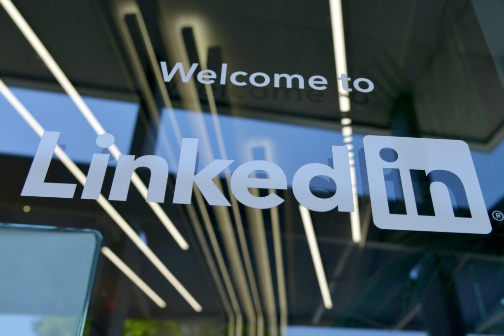
Similar to a Lettermark logo, a logotype (also known as a wordmark) is a font-based logo which focuses on the business’ name. Examples of this include Coca Cola and Google. These are mostly used by companies with a catchy and memorable name as it presents complete originality. The font and colour will add a lot of value to a logotype, combining with the name, all of these features come together to form a recognised brand identity.
Benefits
- Catchy and memorable
- Unique
- Opens other logo options
- Fast recognition
Drawbacks
- Only works for certain names
- Font could become outdated
Pictorial mark logo
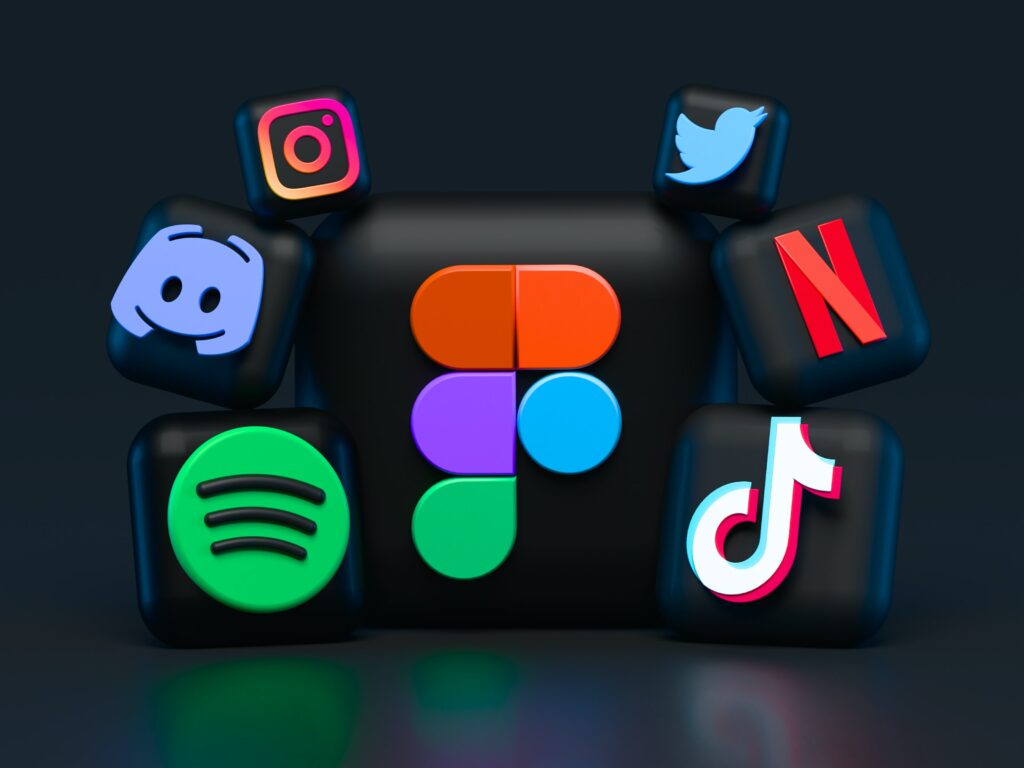
A pictorial mark logo (also named a brand mark) is imagery reduced to its symbolistic form, usually created once a brand is well established. This logo design specifically, has to be representative and contain elements that your audience associates with the brand. A solid pictorial mark is made up of one simple graphic. Examples include Apple or Twitter. It’s also important to remember, this logo will go everywhere with you, so must be something that truly represents the company.
Benefits
- Immediately recognised
- Can create a name and logo as one
Drawbacks
- More effective for established brands
Emblem
An emblem logo is the original logo form. This logotype features text, a symbol, or imagery, placed inside a geometric shape. These logos typically have a traditional appearance which can make a powerful impact, making them a popular choice for schools, organisations or government sectors. An emblem is also much more detailed and can contain several different colours, graphics and fonts.
Benefits
- Original and unique
- Good for representing values
- Bold statement
Drawbacks
- Scalability
- May not fit into trends
Abstract logo
Another logo option is the abstract logo. Made of an image without any letters, this style is a visual representation of a feeling you want your brand to express. Instead of being restricted to a single graphic, abstract logos allow you to create something truly unique to your brand. Examples include BP or Adidas.
Benefits
- Recognisable
- Simple but includes name and image
- Good for print media and merchandise
- Versatile
Drawbacks
- Most powerful when brand is well established
Mascot
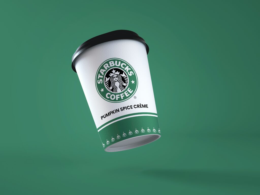
A mascot logo is a drawing of a person or a non-human figure that presents a human form or human attributes. This style of logo creates a warm, friendly and positive feeling and is ideal for presenting different expressions and representations. Mascot logos are usually seen in the branding of sports teams or fast food chains.
Benefits
- Friendly and welcoming
- Family friendly approach
- Bold statement
Drawbacks
- Not so professional
- May not suit every marketing material
Combination logo mark
A combination mark is simply a combination of different logo styles. This option is ideal if you can’t decide on one type or have ideas for a couple of them. This logo could include your brand name and mascot or lettermark and emblem. A combination mark is also ideal if you’re planning to venture into many marketing avenues. This logo can be adapted and changed easily to suit business needs.
Benefits
- Adaptable
- Recognisable
- Creative
Drawbacks
- Can become too crowded
- Not suitable for simplicity
