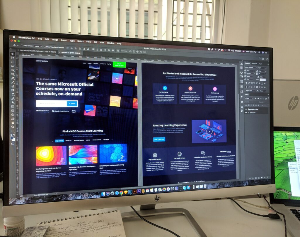
Have you ever gone on a website on a tablet or phone only to find the picture cuts in half? Maybe the text doesn’t fit the page so you have to endlessly scroll? Chances are, the website you were on wasn’t responsive. In short, the website has been designed for a single device (namely a desktop computer) and so it won’t display correctly for any other device.
Websites that are optimised correctly for multiple devices are known as responsive. Far from being a fancy term developers use, having a responsive website will greatly increase traffic and overall user experience.
Here’s everything you need to know about responsive web design, why it matters and what to do if yours is non-responsive.

Responsive web design
The shift from desktop to mobile internet use is steadily climbing. The latest figures suggest that 63.4% of all internet browsing is now done on phones rather than any other device. These statistics matter, especially as not all websites are correctly optimised for all devices.
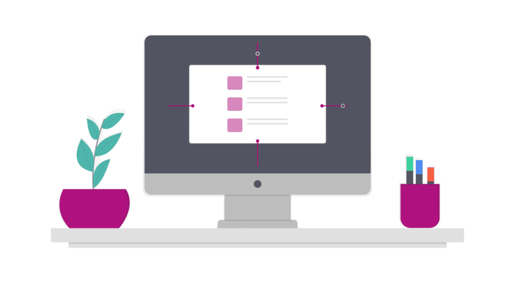
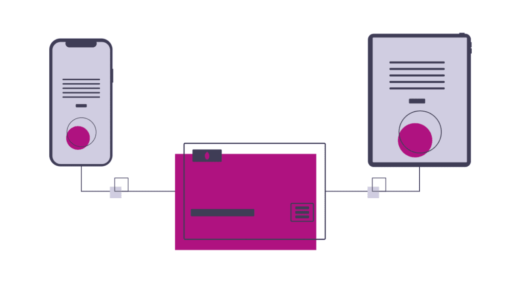
Responsive web design means your website automatically adjusts to fit the dimensions and type of device someone is viewing your website on. See our above example on how the Imaginaire Digital website is viewed on a phone versus a desktop computer.
On a desktop, you can see how the background fills the space of the screen. On a mobile, the design is different to reflect the difference in screen size, and how we scroll differently compared with a desktop screen. Our responsive website means that regardless of the device you view our website on, you’ll be able to find everything you need with ease.

Non-responsive web design
The Space Jam website is something of an internet legend. It was created for the 1996 movie of the same name and hasn’t been updated since. A shrine to the infancy of web design. What you will notice however is that as a result, the pages aren’t optimised to mobile devices. Given the 90s was long before most people had a mobile phone, let alone one with a screen/the internet, this perhaps isn’t a surprise. However, it’s not uncommon to find lots of websites made much more recently that are equally non-responsive.
This one-size-fits-all approach to web design means anyone not viewing your website on a desktop pc will find text/images have cut off. There might even be only half of a video screen with no way of zooming out to view it properly. If your website isn’t accessible across all devices, that leaves large swathes of people who won’t be viewing, sharing or ordering from it.
Website responsiveness also factors in the practical elements too. With a mobile or tablet, you don’t have a mouse to click or scroll through the page. So, not only is the screen sizes different but how we operate the device is too.

Why responsive web design matters
If your website isn’t correctly optimised then expect your bounce-back rate to soar. After all, why would visitors hang around if the images cut off or if they can’t read the text properly? The bad news keeps coming for non-responsive websites: it’s terrible for SEO too. Google (or any other search engine) isn’t going to send people to websites that have a high bounce back rate. Why? The quick exit suggests to its algorithm that your website is an unhelpful match for what they are looking for. Your website then slips further down their rankings. This can mean you are losing both vital traffic and sales to your business.
Some website builders will allow you to create templates with a view option for both desktops, mobiles and tablets. This is useful to give you an idea of how accessible your website is. Every device will require the website to fill the space differently (refer to our Imaginaire example above). Therefore, by checking your site is correctly optimised and testing it on each device before it goes live, you can avoid any problems.
It’s also worth checking your website analytics to check how users are accessing your website. If a large majority are trying to access your website on a mobile, but your website is only optimised for desktop, is it any surprise your conversion rate is low? If that sounds like your website, now is the time to take action.
Help! My website is non-responsive
Don’t panic, this isn’t an episode of Grey’s Anatomy. There is hope for your website but only if you place it in the right hands. Did you know that half of all users will never return to a website they couldn’t access properly? Think about that for a second. Can you afford to lose half your potential customers? That’s exactly what you are effectively doing if your website is non-responsive.
Fortunately, here at Imaginaire Digital creating beautiful (responsive!) websites is what we do as well as offering services in web development through the engineering, construction, jewellery, retail and luxury e-commerce sectors. By redesigning your website so that it’s automatically optimised for all devices, it will display as intended for all users. As a result, you will attract more visitors to your website and keep them on there for longer. Sprinkle in some SEO throughout your landing pages and you’ll see your Google rankings climb in no time.
Want to find out more? We’d be more than happy to take a look at your website. Book in for your free consultation by clicking here, or give us a call on 0115 971 8908 to learn more. Likewise, if you’re creative and looking into career options, take a read through our web design career guide to find out how you can plan the next steps to your dream job!


